
Maternal Health & Wellness
To provide pure, natural care that helps mothers produce breast milk, heal faster, and feel confident.
Brand Strategy
Visual Identity
Storytelling
The Challenge
Supporting
the Silent
Strength of
Mothers
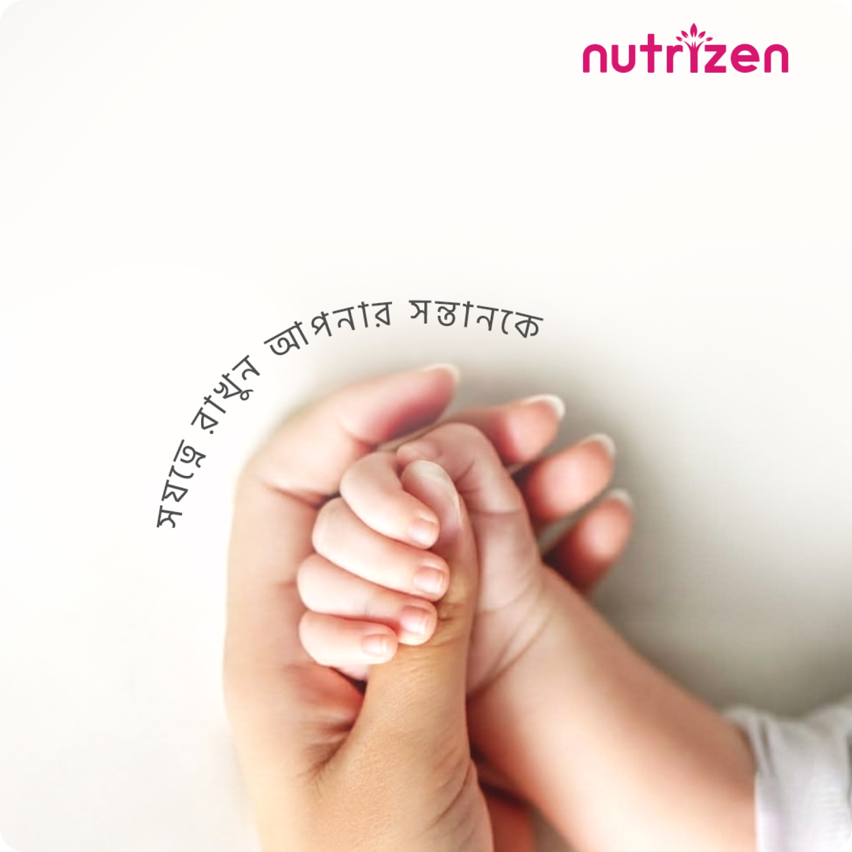
Motherhood is beautiful, but it is also demanding. Nutrizen needed to enter the market not just as a supplement provider, but as a partner in recovery. The challenge was to create a visual identity that didn’t feel clinical or medical. It needed to feel like a “gentle shade every mother can rely on” balancing the science of recovery with the warmth of a mother’s touch.
The Strategic Narrative
As
Pure
As
Nature
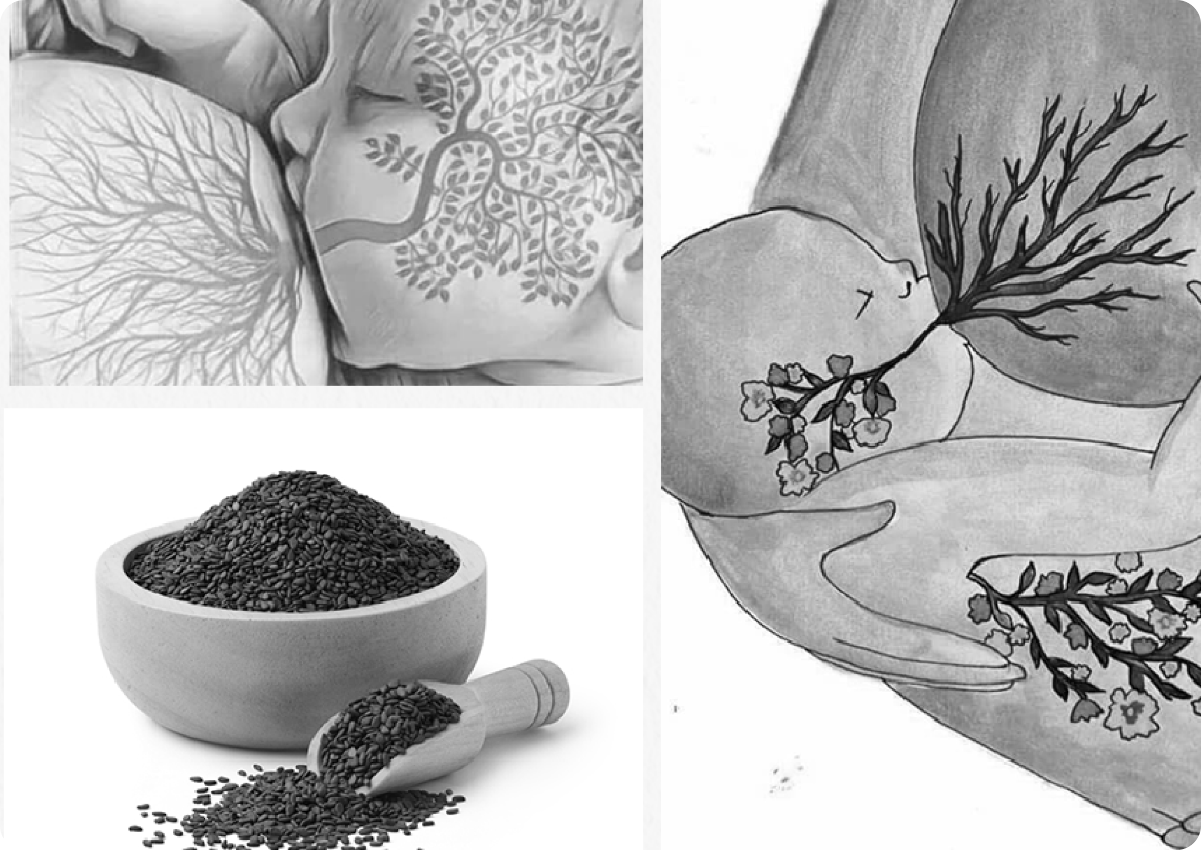
We built the brand story around a powerful metaphor: “Like a tree nourishes the earth with its roots, leaves, and fruits, Nutrizen nourishes mothers.“
The Core Values
We Defined
Four Pillars
To Guide The Design
Purity
Using natural, organic ingredients mothers can trust
Bond
Supporting the deep connection between mother and child
Strength
Helping mothers recover their body and mind
Care & Trust
Building confidence through honesty and consistency
Visual Identity System
Merging
Nature
with
Science
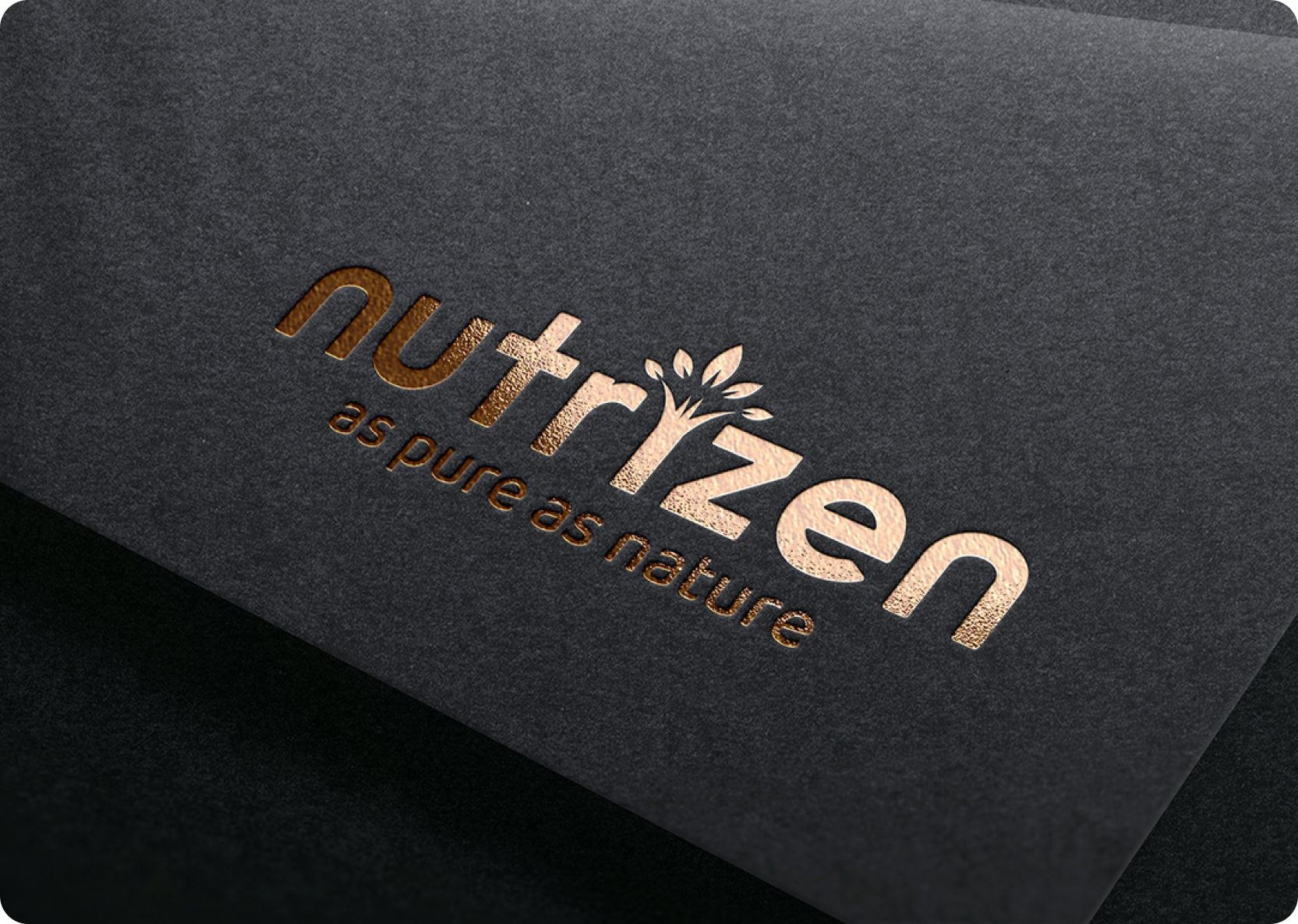
The Logo Concept
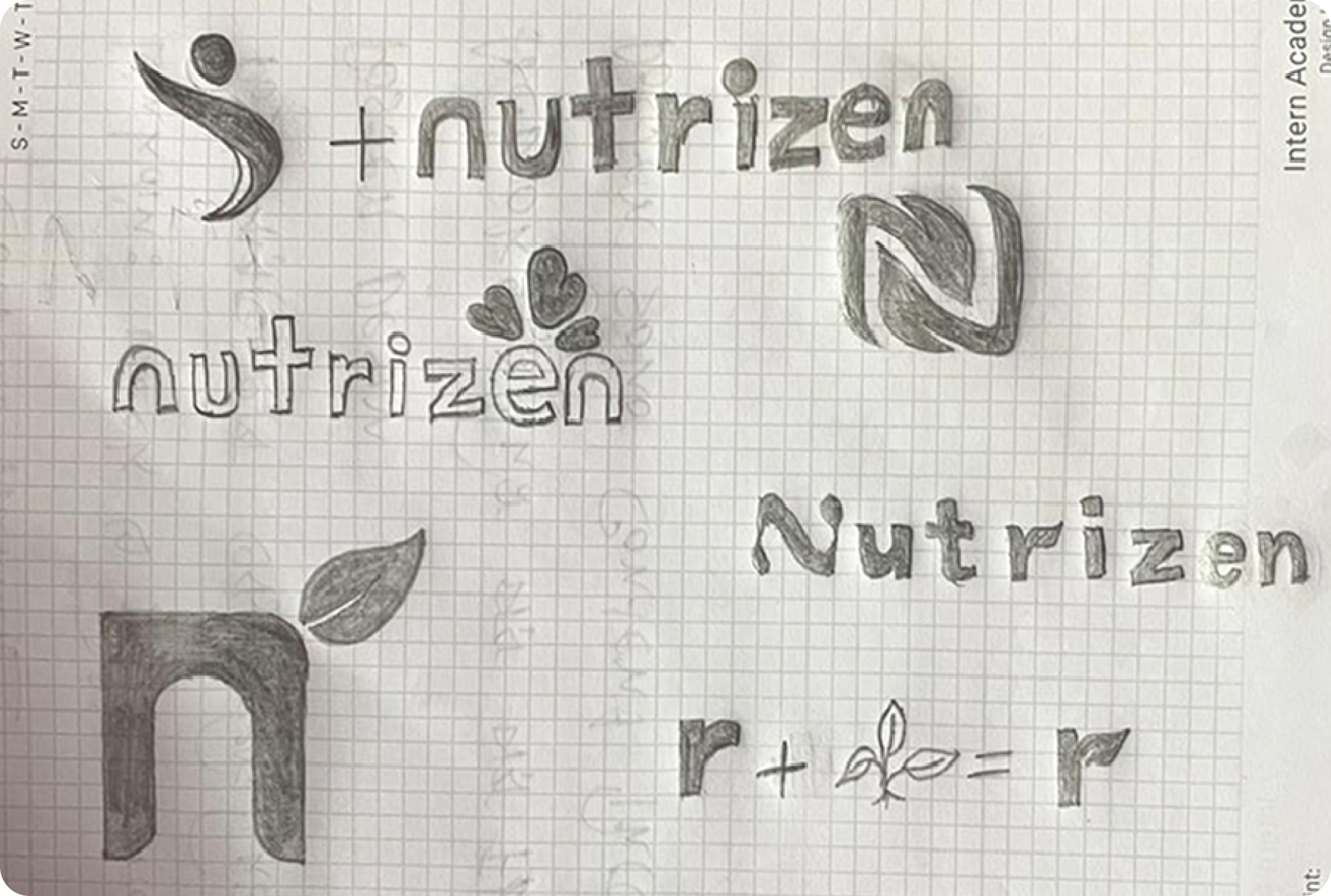
The sketching phase explored the intersection of organic shapes and stability. We combined the letter “N” with leaf motifs and heart shapes to visually represent growth, nature, and the embrace of a mother.
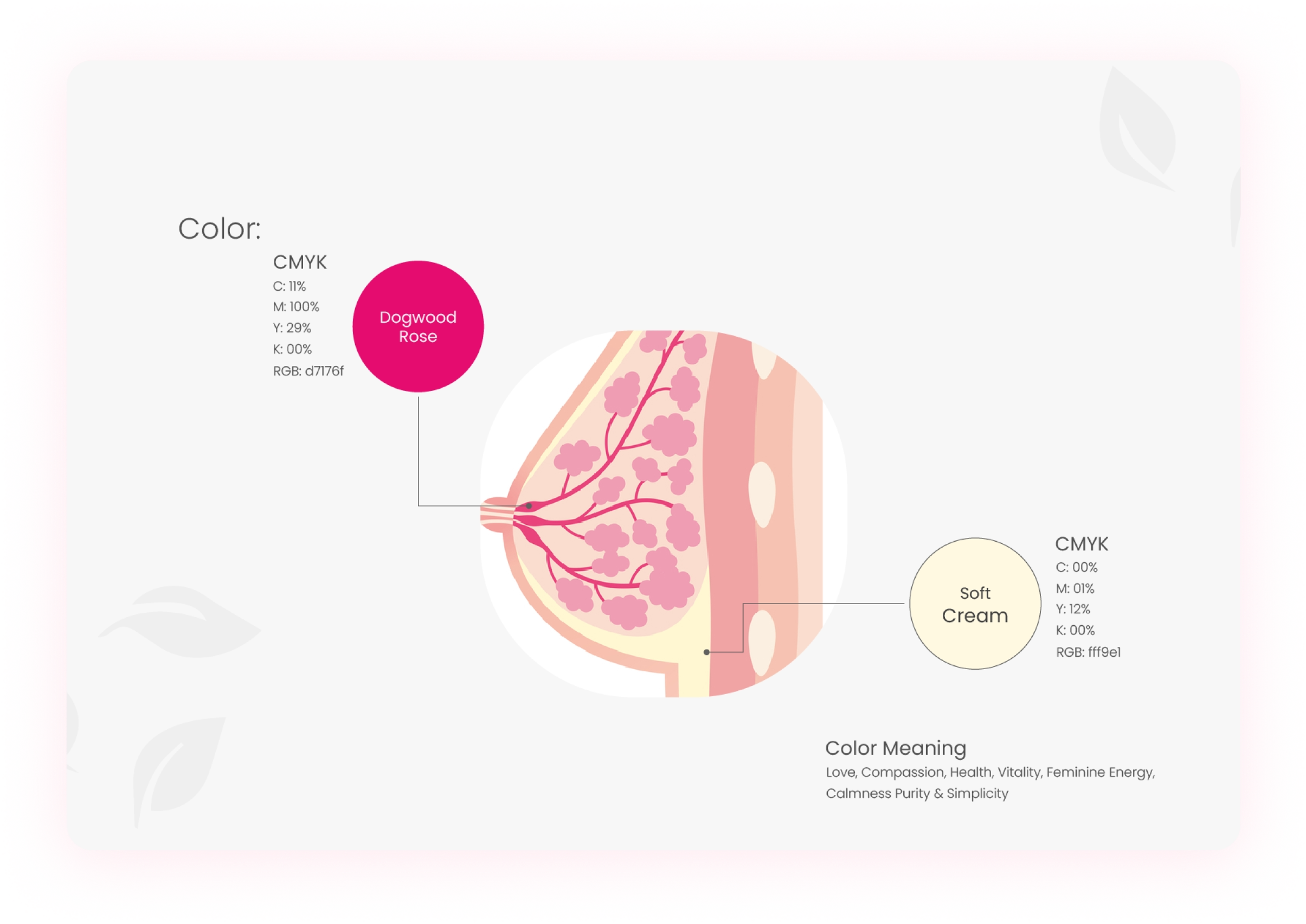
Color Psychology
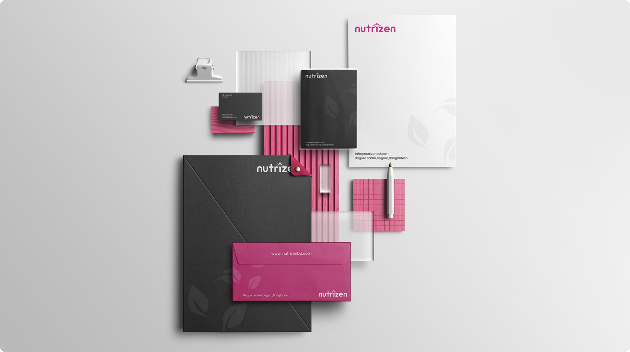
We moved away from cold medical colors and embraced a palette that feels alive and feminine:
- Dogwood Rose (Pink): Represents love, compassion, vitality, and feminine energy.
- Soft Cream: Represents calmness, purity, and simplicity.
Tone of Voice
The brand speaks with warmth like a friend or family member. It is encouraging, emotional, and always positive, touching hearts rather than just giving information.
The Impact
A Brand That
Mothers Trust
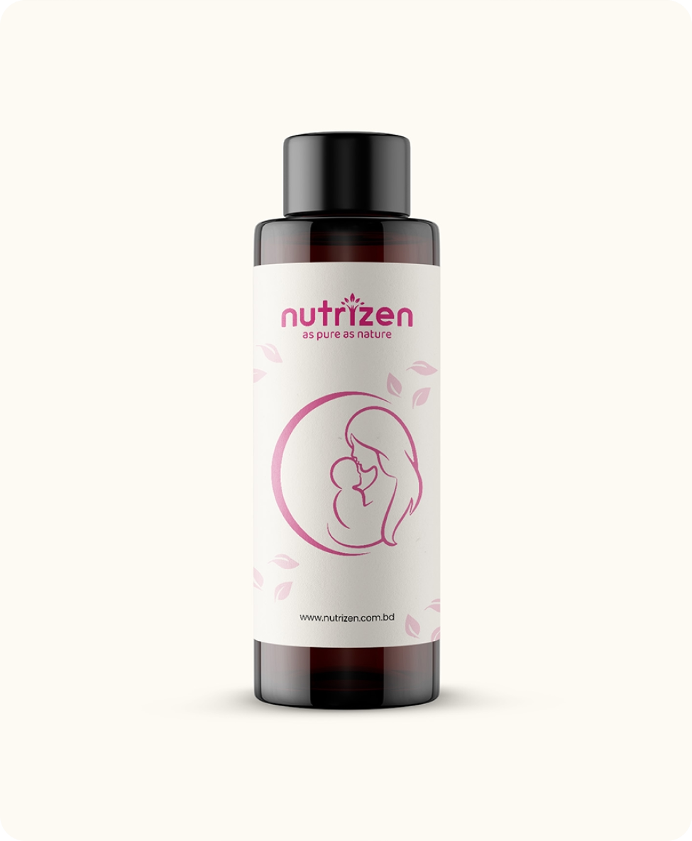
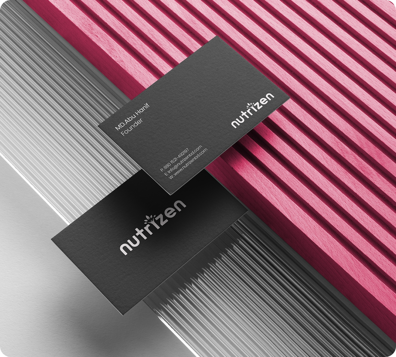
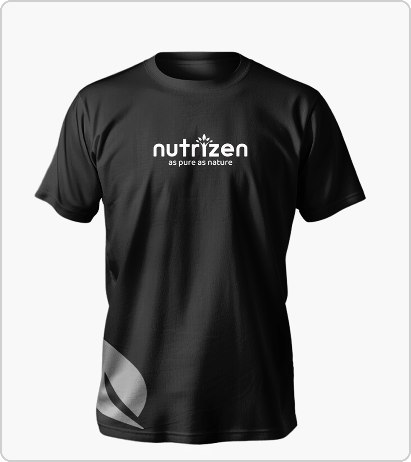
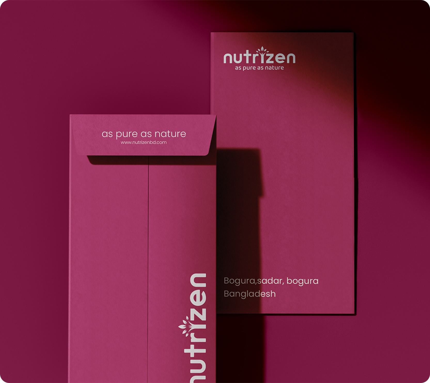
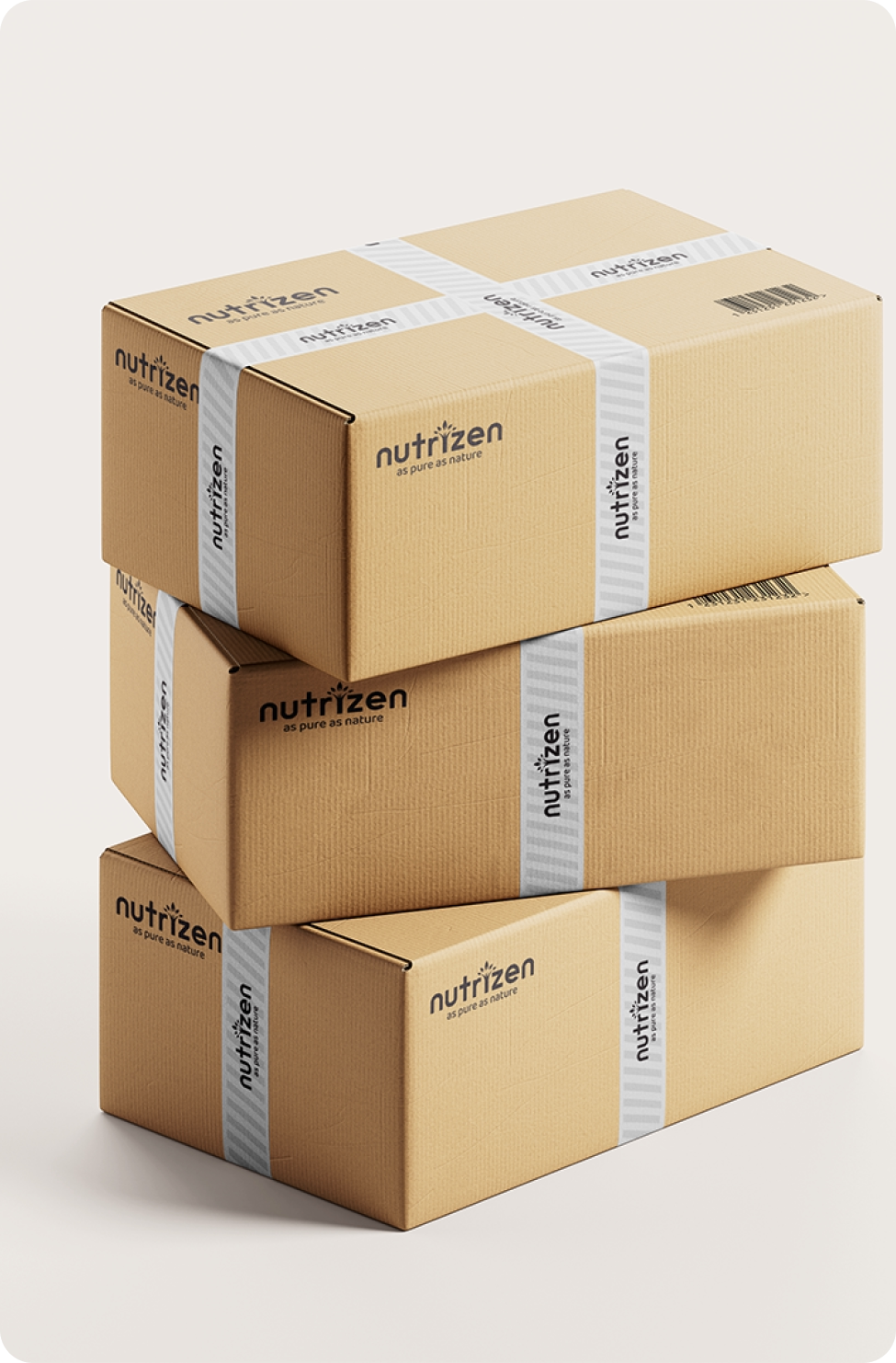
Nutrizen now stands as a cohesive brand that visually communicates its promise: “From the touch of a mother grows the confidence of a child.” The new identity successfully positions Nutrizen as a premium, approachable, and authority-driven organic brand for new beginnings.
Here is Some
Visual
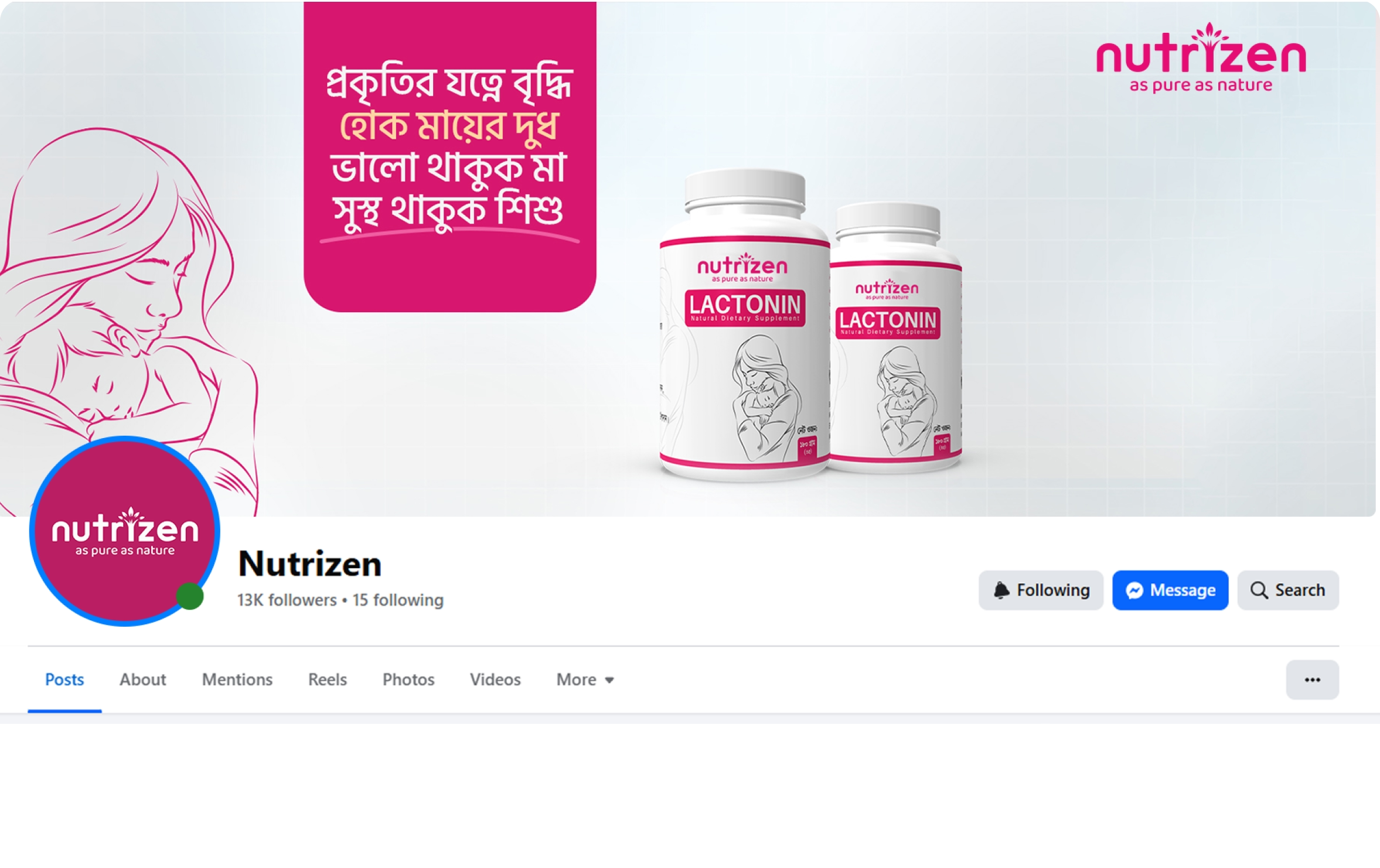
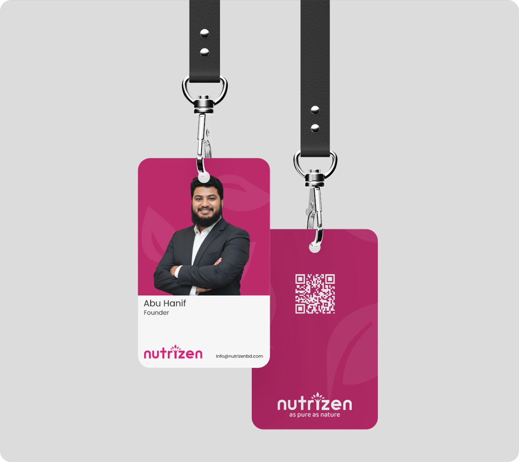
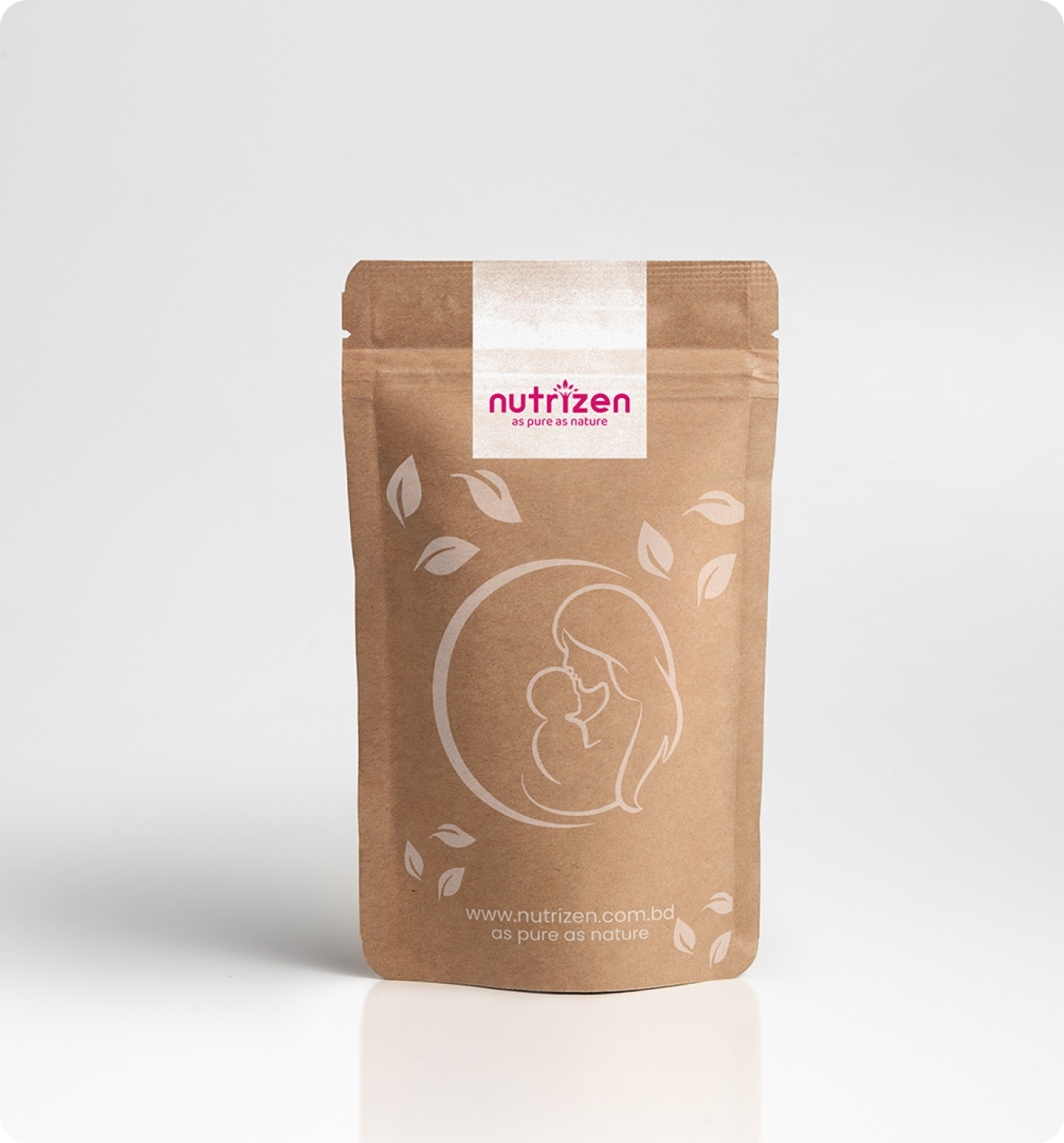
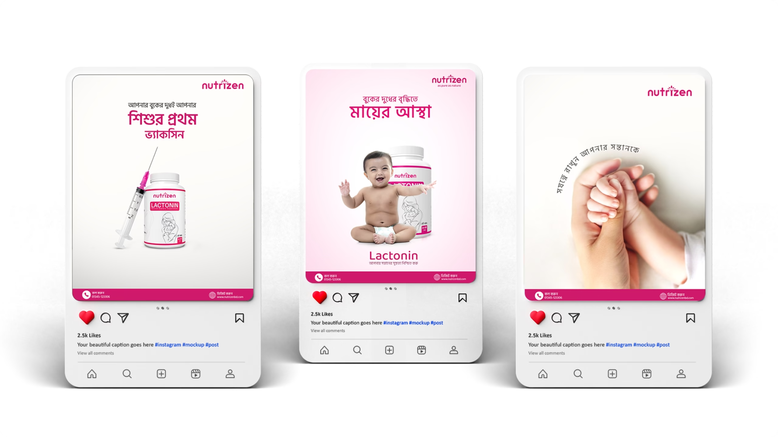

Client’s Speech
“Rahat captured the exact emotion we were struggling to express.”
“We needed Nutrizen to be more than just a supplement brand; we needed it to feel like a ‘gentle shade every mother can rely on’. Rahat understood this immediately. He moved us away from cold, clinical branding and created an identity that perfectly balances ‘Nature with Science’.
The thought process behind the logo and the ‘Dogwood Rose’ color palette was exceptional it feels warm, feminine, and trustworthy. He didn’t just give us a design; he translated our core values of ‘Care, Purity, and Strength’ into a visual system that mothers instantly trust.”
Abu Hanif | Founder of Nutrizen