
The Human Centric Marketplace Revolution
Combining human empathy with digital innovation to help your business thrive on Amazon, eBay, and beyond.
Brand Strategy
Visual Identity
Storytelling
The Challenge
In the high-stakes world of Amazon, eBay, and Walmart, the landscape is often viewed as a cold, mechanical “puzzle” of algorithms and account issues. Small and medium businesses frequently feel like just another number, lost in a sea of technical jargon and aggressive competition. The challenge was to create a brand identity that felt technically superior yet deeply approachable, bridging the gap between complex data and human success.
The Strategic Narrative
We shifted the focus from managing accounts to nurturing growth. The narrative centers on the idea of the Growth Partner. Like a gardener tending to a seedling, Smiling Group provides the system and the care, while the client harvests the success. This story is built on the belief that where others see a barrier, we see a bridge where others see a problem, we see a possibility.
The Core Values
We Defined
Four Pillars
To Guide The Design
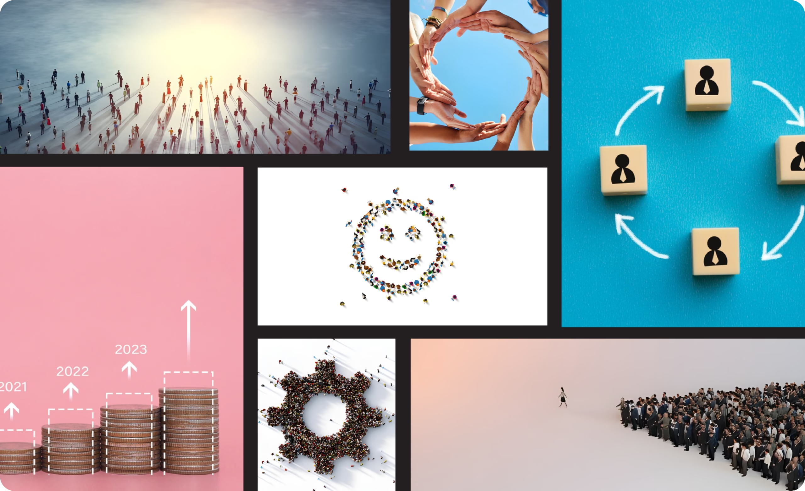
Growth with Purpose
We don't just chase numbers we build sustainable, meaningful expansion.
Simplicity
We take the complex machinery of global trade and make it clear and manageable.
Integrity
Honesty and transparency are the bedrock of our global trust.
Positivity
We believe every challenge is an opportunity to improve, starting with a positive outlook.
Visual Identity System
Merging
Nature
with
Science
The Logo Concept
- Trigger Words: The identity is anchored by concepts like Empowering, Innovative, and Global.
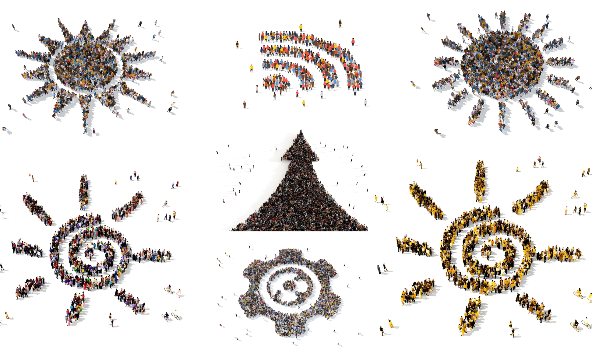
- Graphic Language: We utilize imagery of solar eclipses and sunrises to symbolize “The Next Phase” and “Clarity coming out of darkness.”
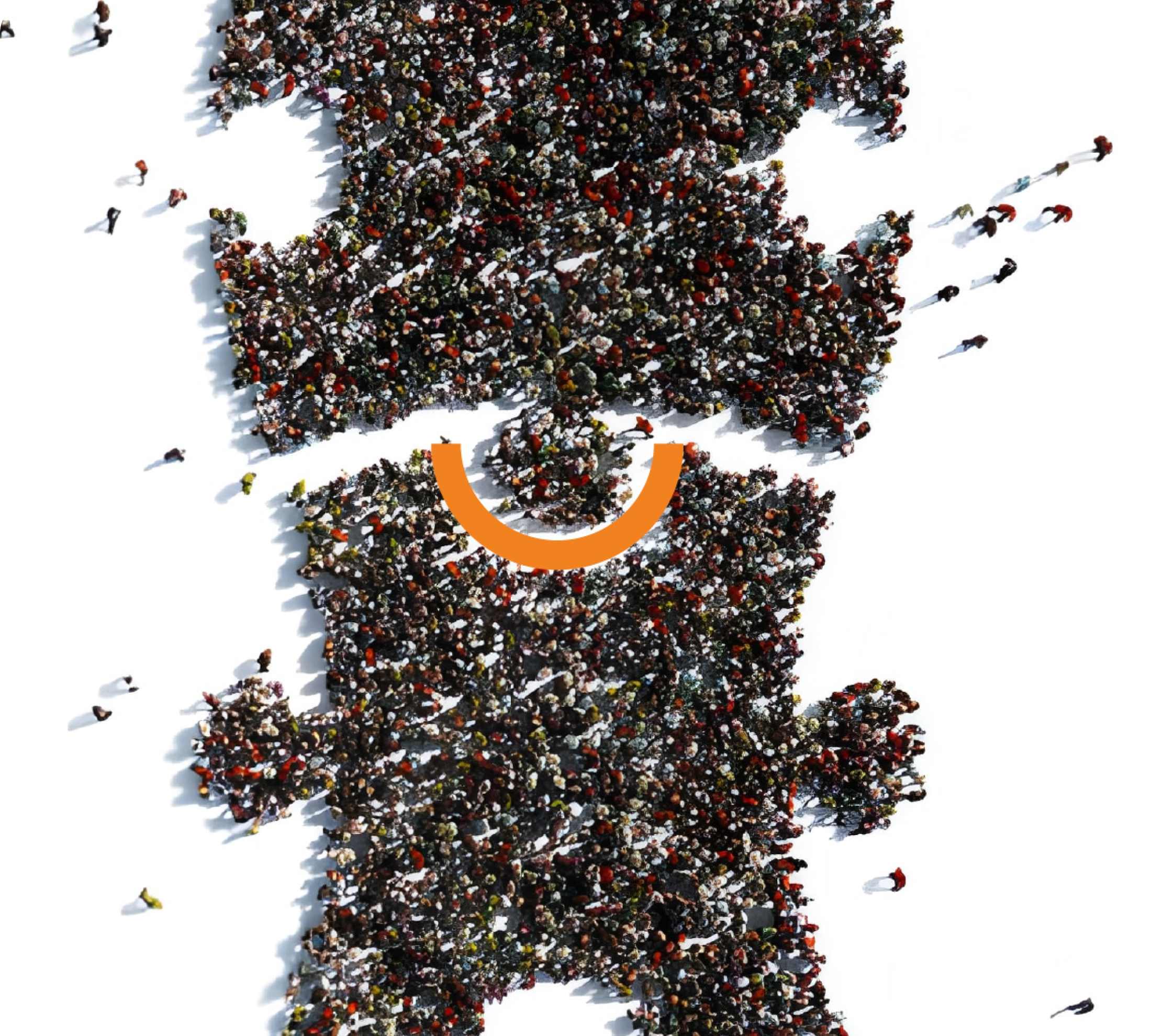
- The Puzzle Metaphor: Visuals show people coming together to complete a puzzle, signifying that Smiling Group is the “missing piece” for SMBs.

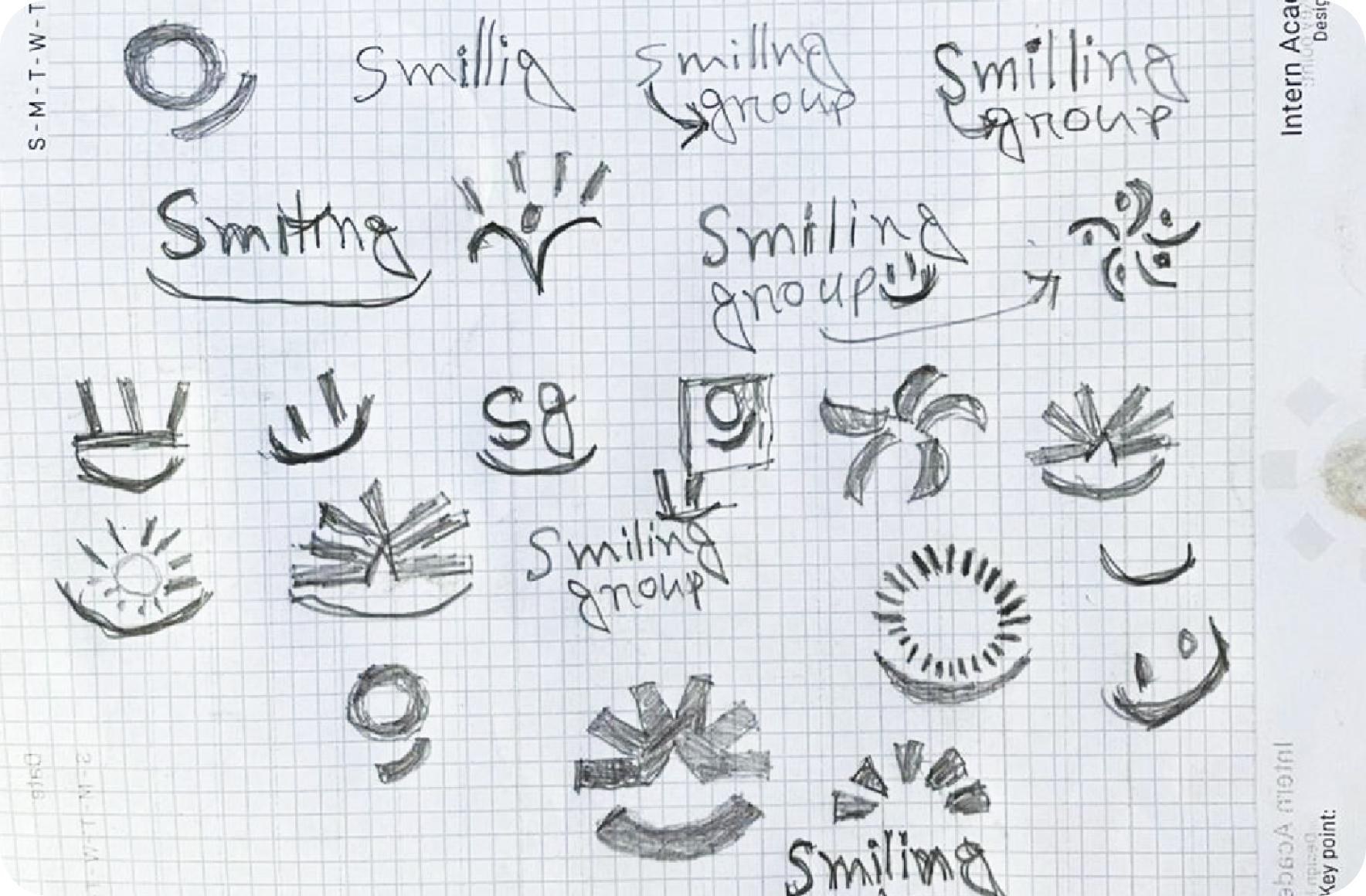
The Logo Sketch
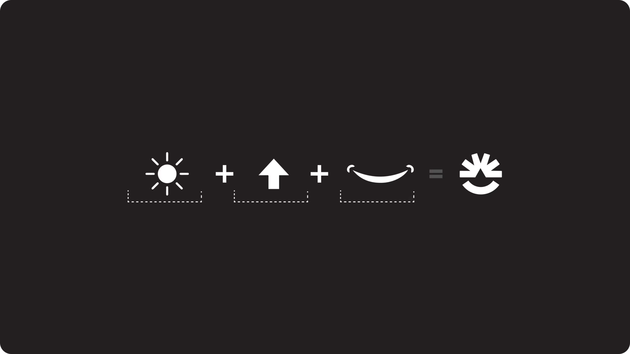
The logo is a mathematical synthesis of three core symbols:
Sun (Energy/Bright) + Upward Arrow (Growth/Success) + Smile (Human Connection) = The Smiling Group Mark
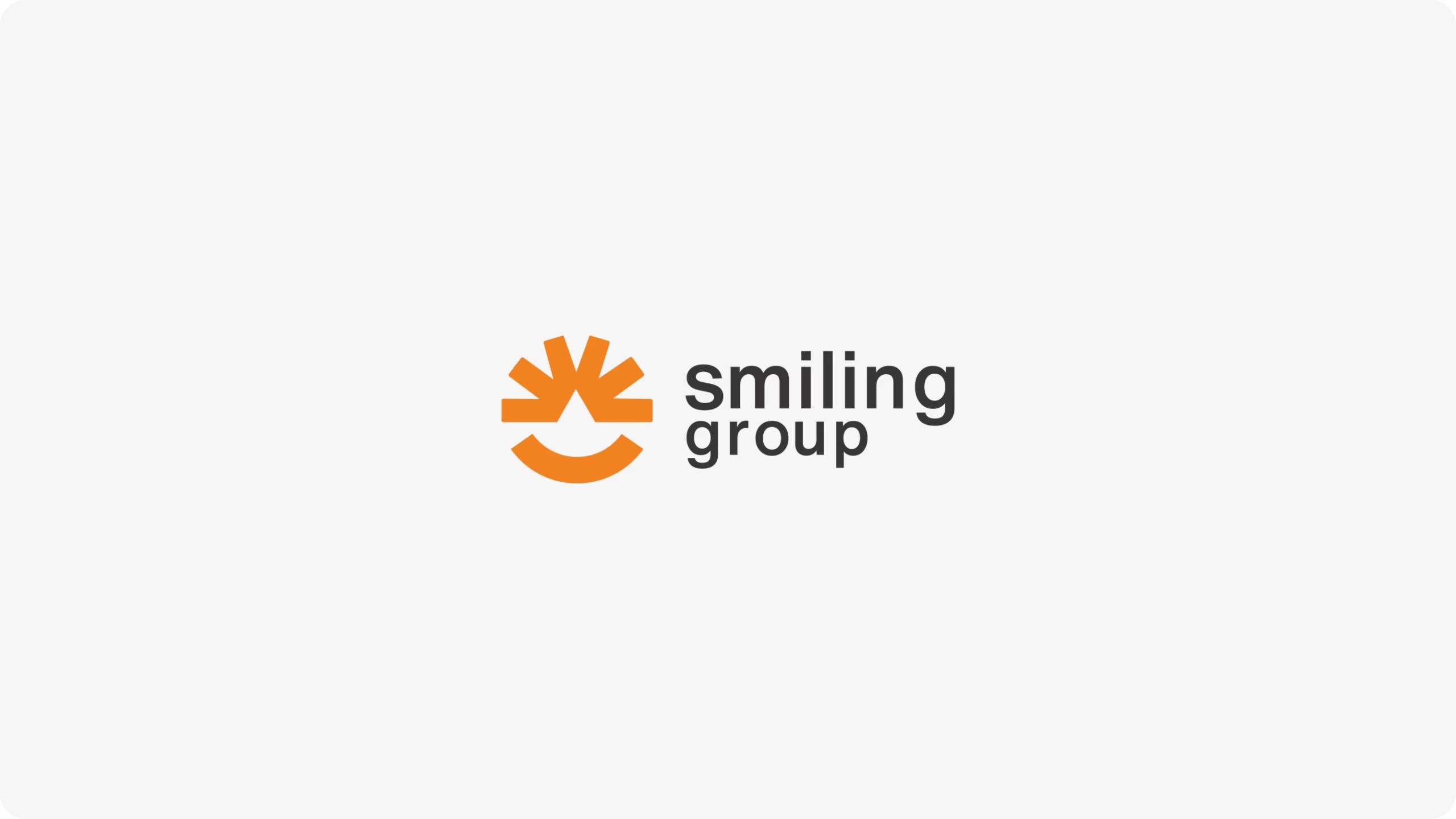
Final Logo
Color Psychology
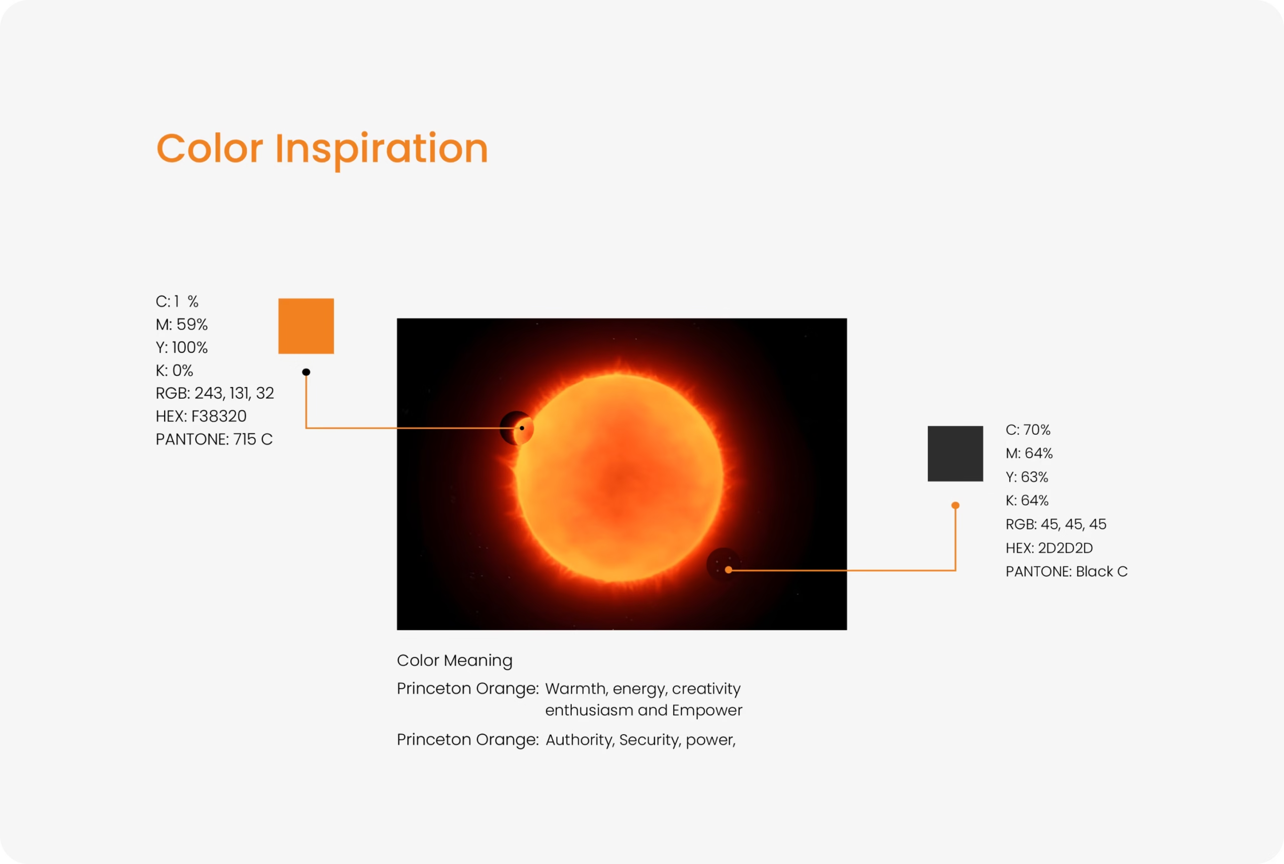
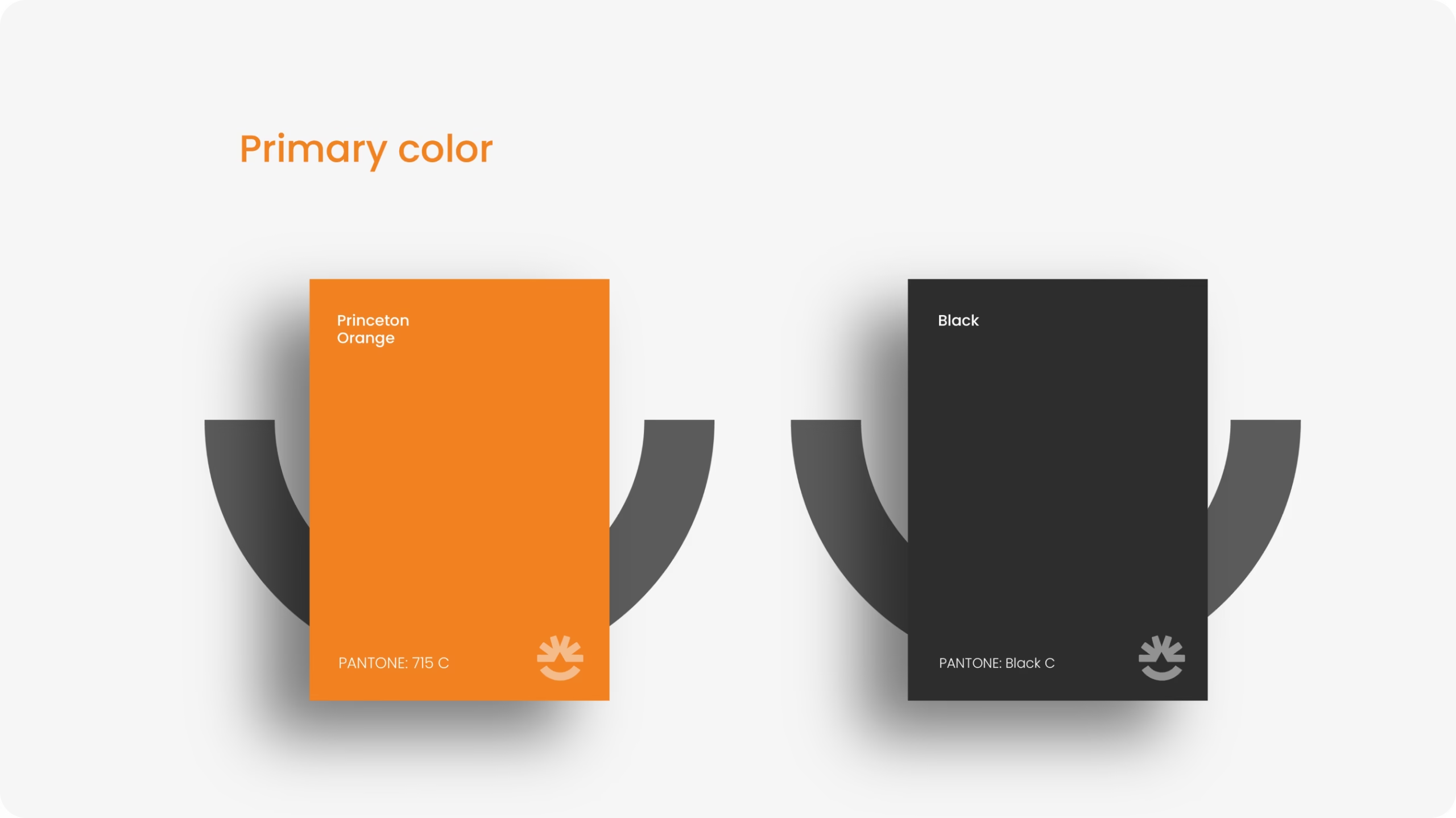
- Vibrant Orange: Chosen to represent warmth, energy, and optimism. It triggers feelings of confidence and friendliness.
- Deep Charcoal: Provides a sophisticated, Trusted foundation that allows the orange to pop, symbolizing clarity emerging from a complex background.
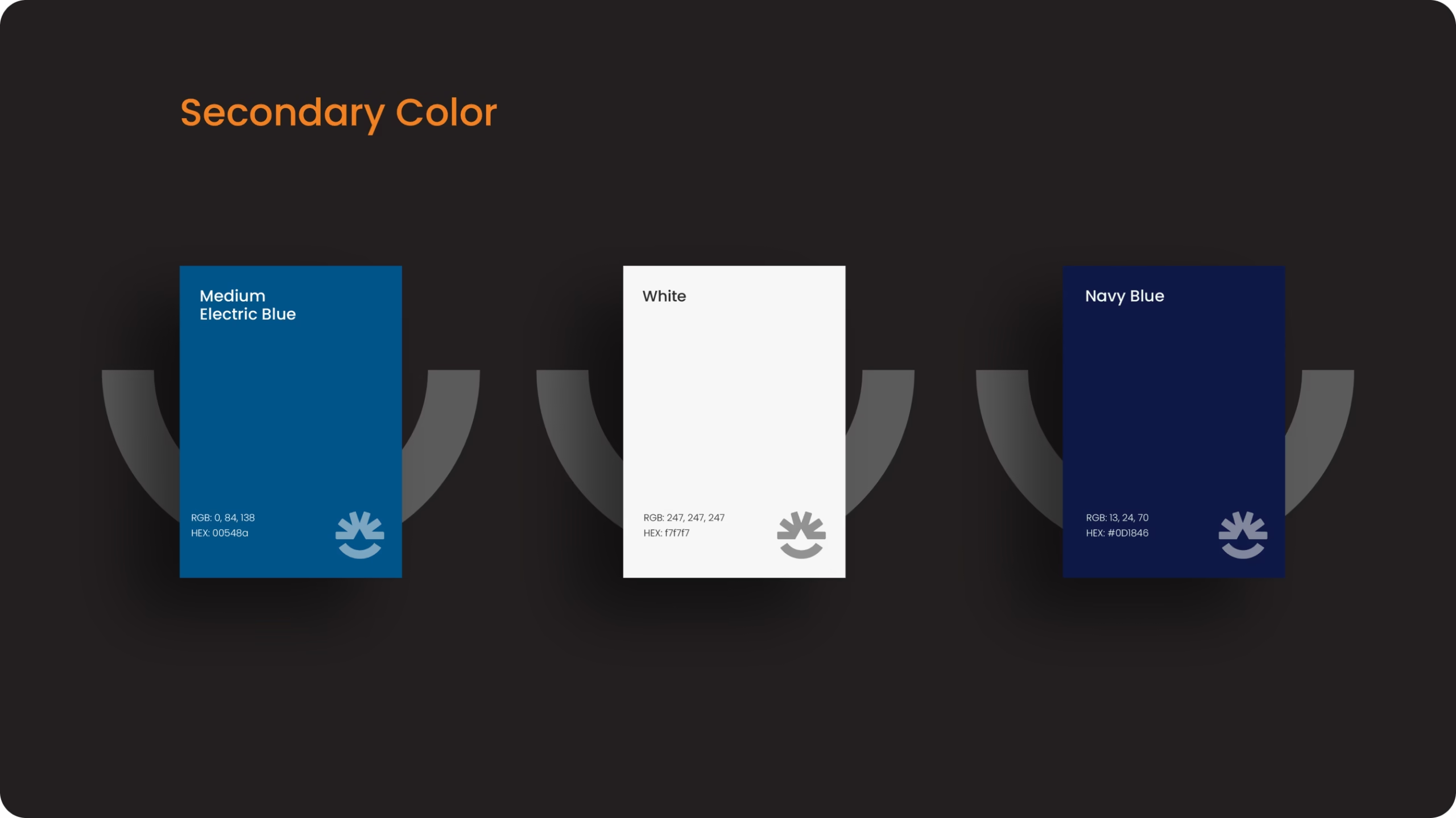
- Clean White: Used for “Simplicity” and “Honesty,” ensuring the brand feels open and transparent.
Typography
The Impact
A Brand That
Mothers Trust
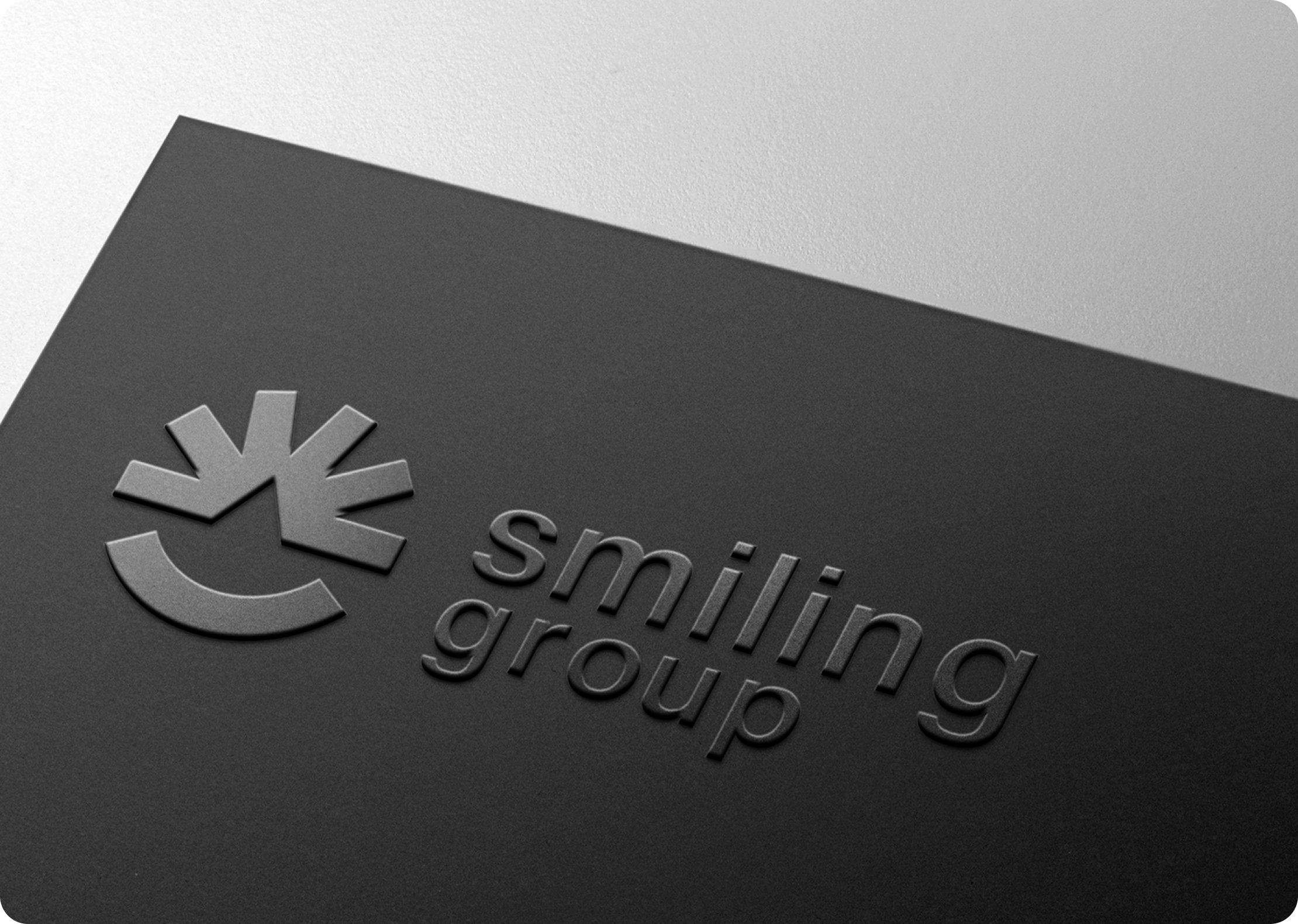
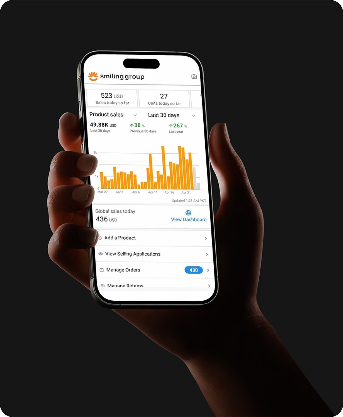
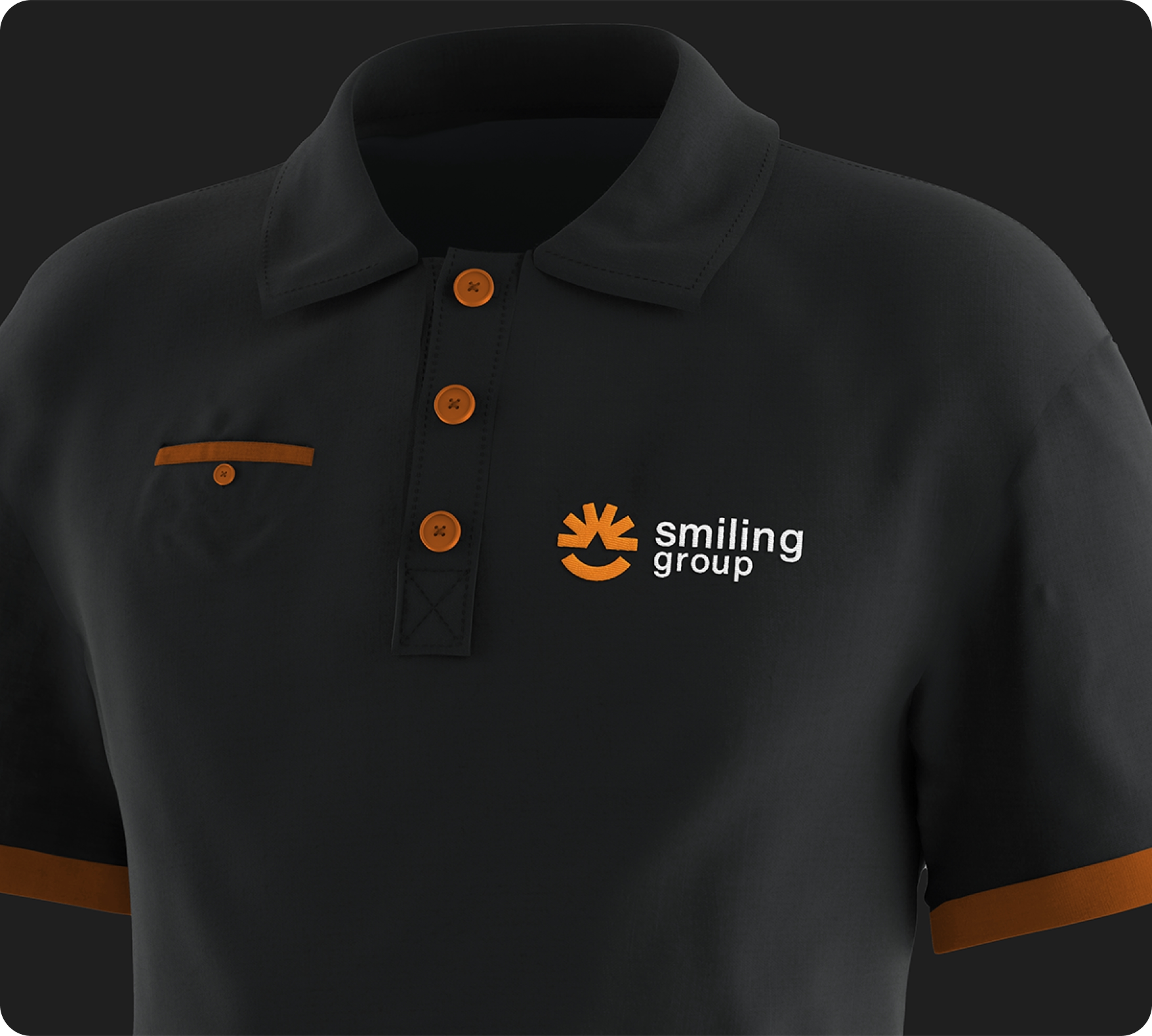
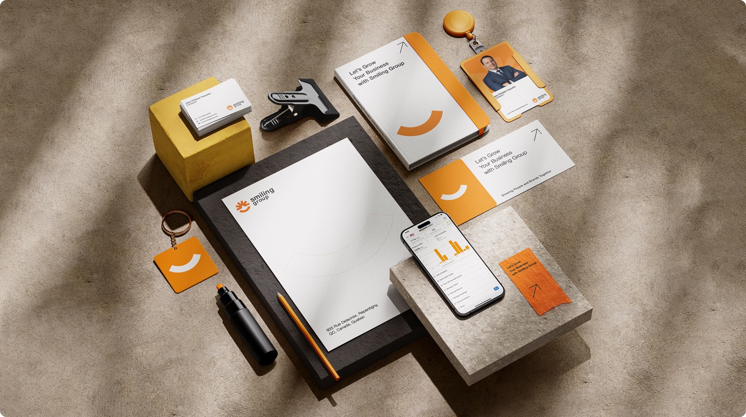
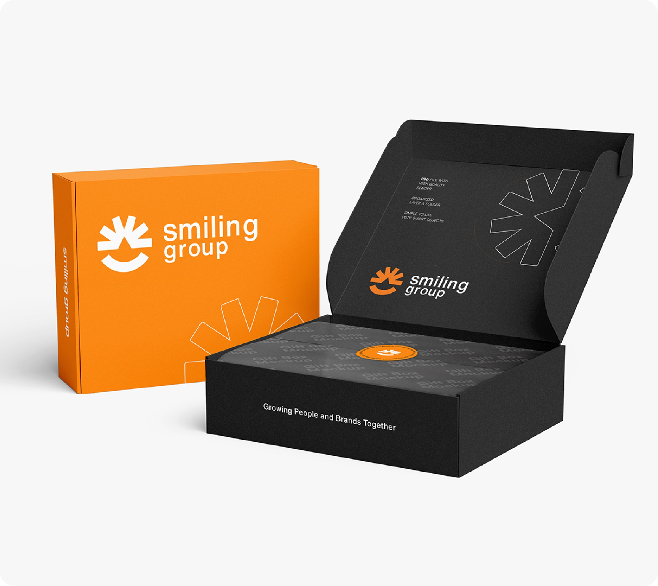
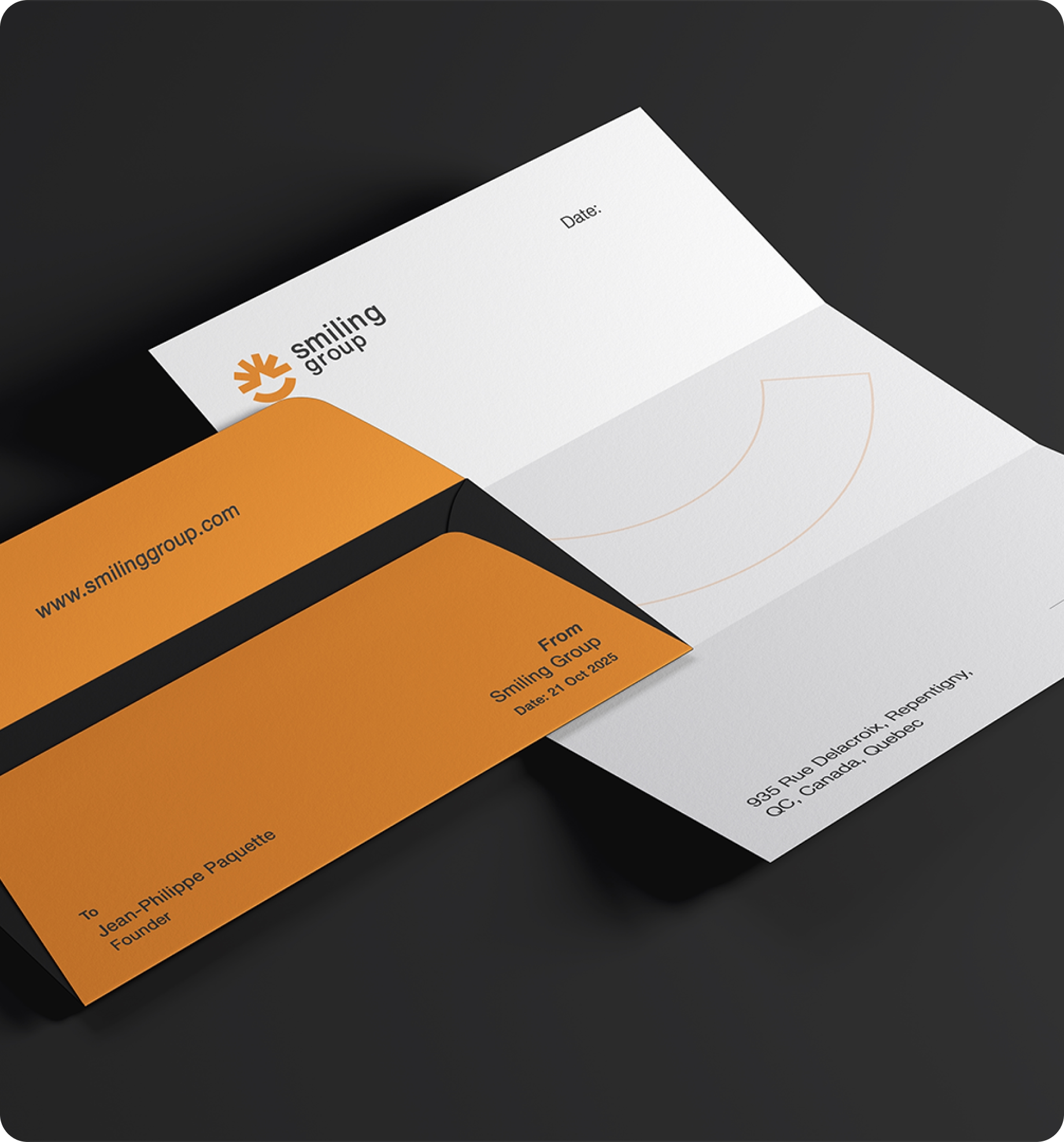
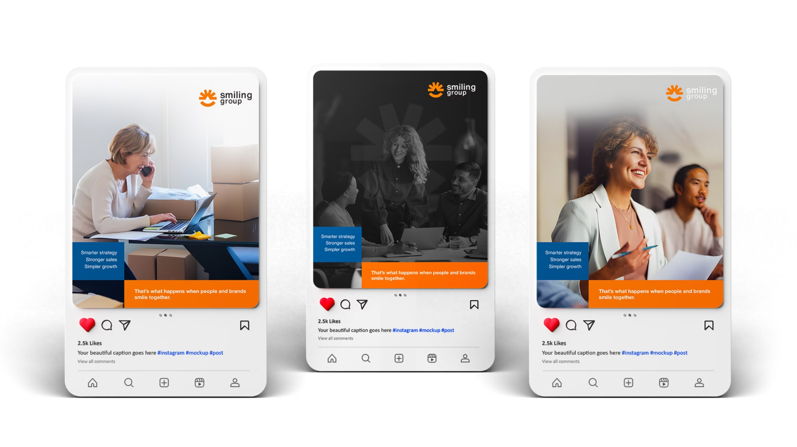
Smiling Group now stands as a cohesive brand that visually communicates its promise: “When our clients grow their sales, we grow with them side by side.” The new identity successfully positions Smiling Group as a premium, approachable, and growth-driven global partner for digital innovation.
Here is Some
Visual
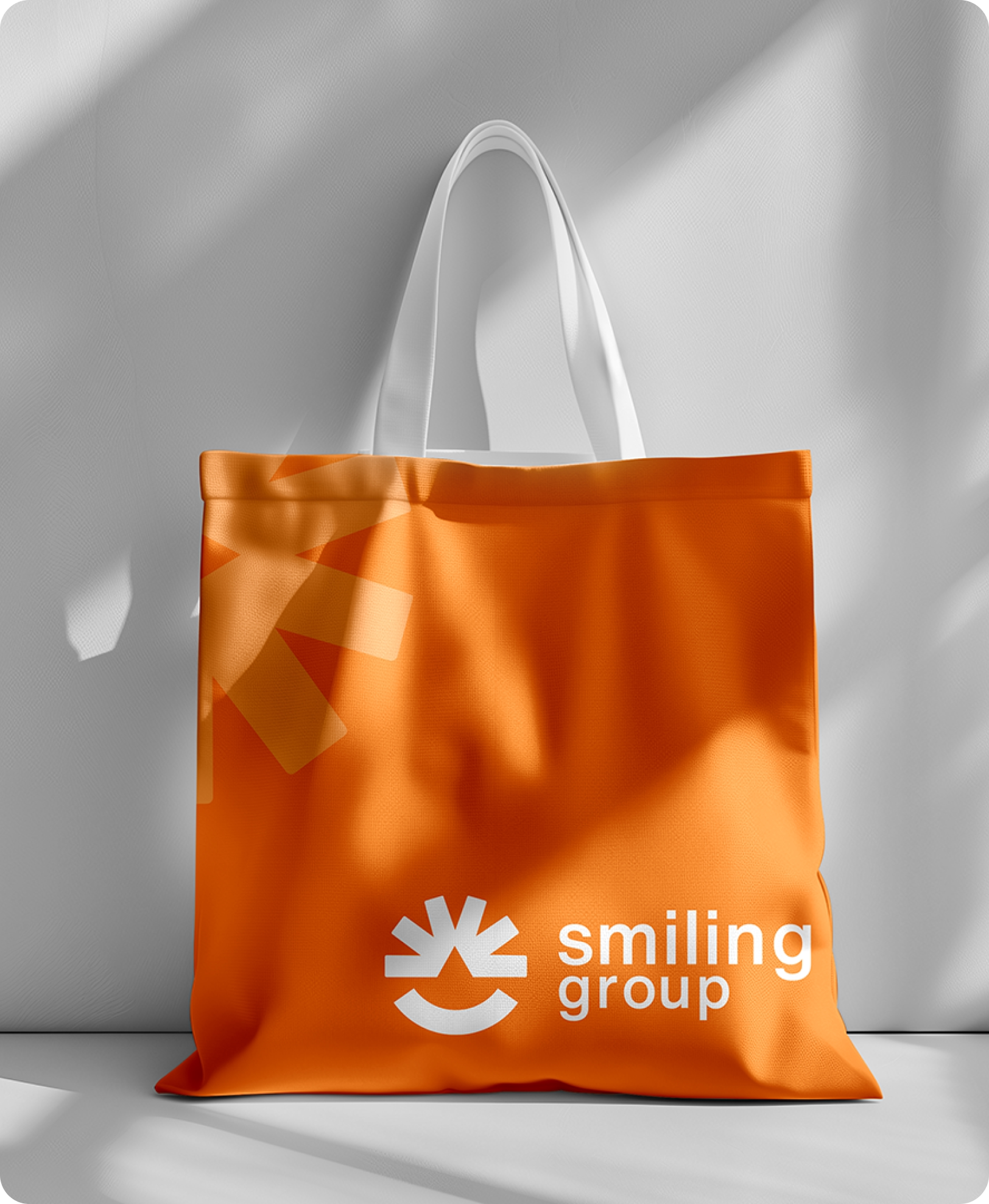
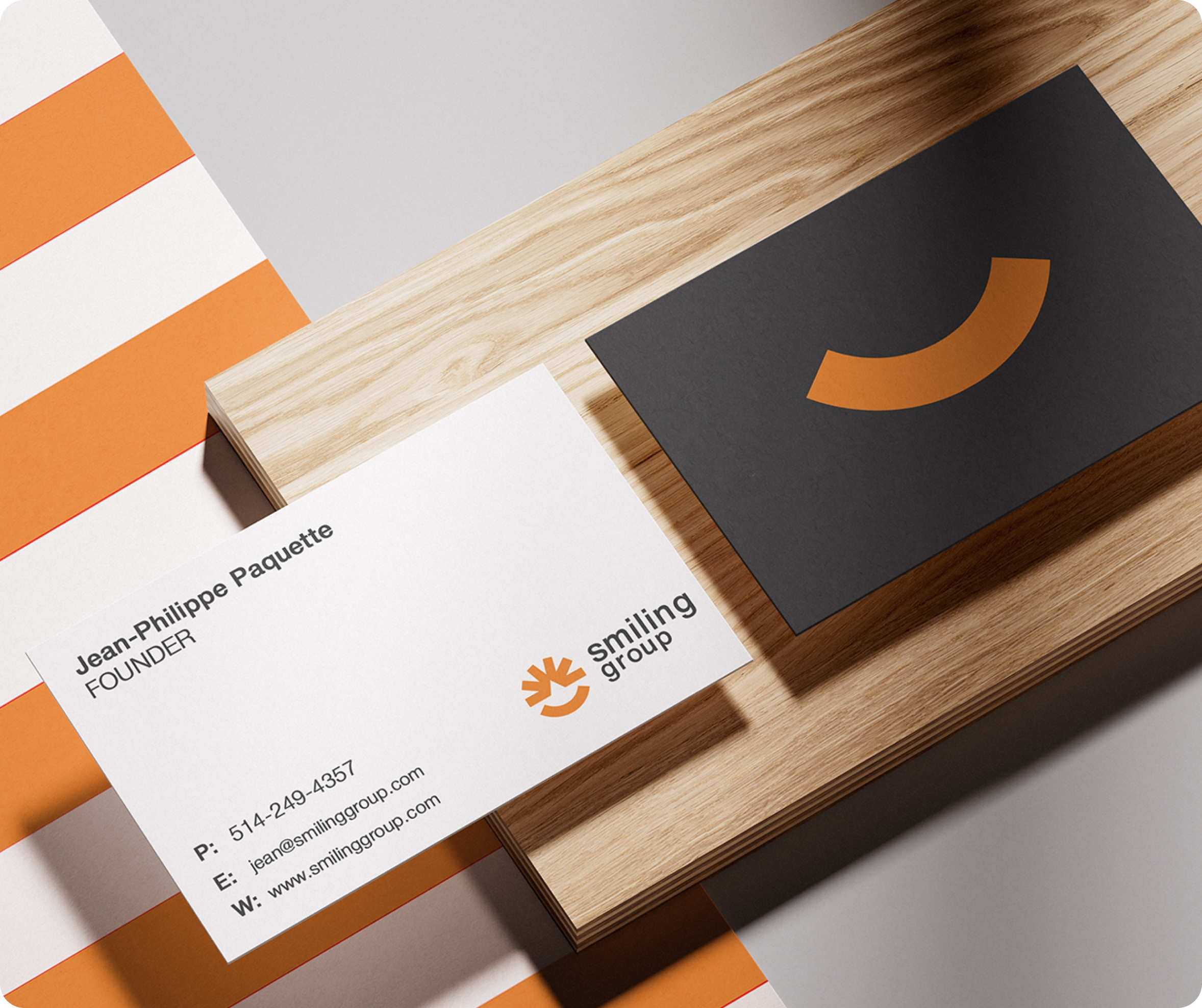
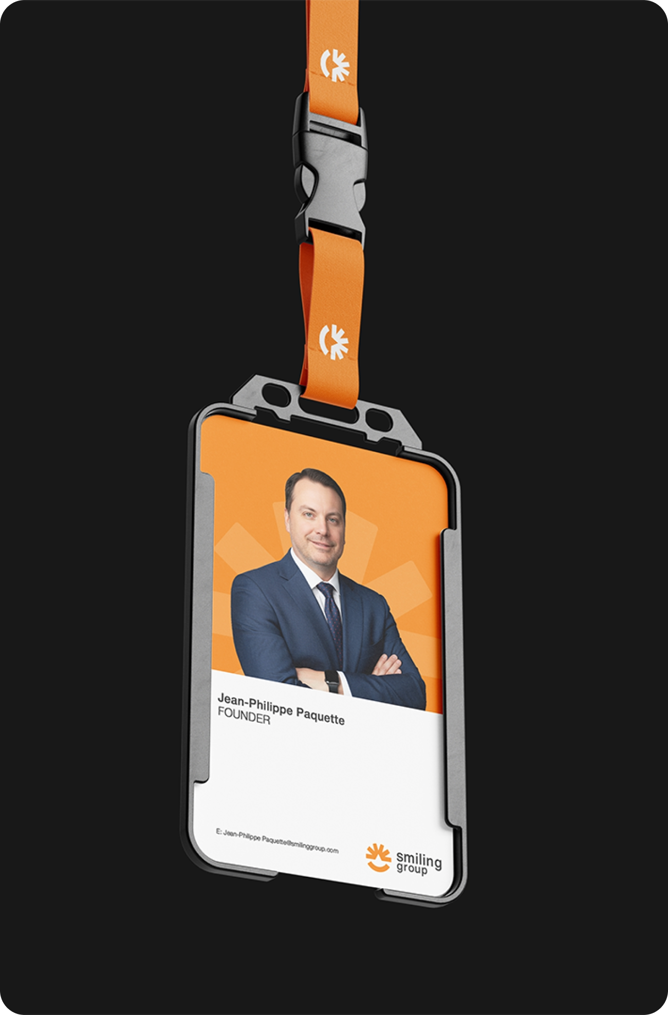
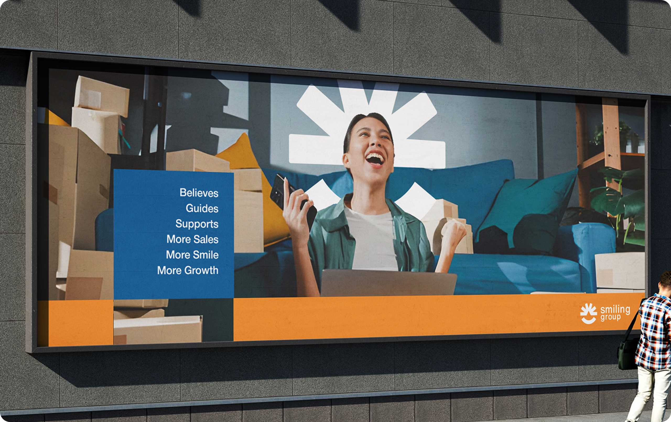

Client’s Speech
I am beyond impressed with you, Rahat! How you’ve transformed Smiling Group. You took our complex services like marketplace management and made them feel incredibly human and approachable.
The way you balanced the sun, the arrow, and the smile in the logo is brilliant. It perfectly captures our promise of side by side growth.
We finally have a brand that feels as warm as it is professional.
Fantastic work!
Jean Philippe | Founder of Smiling Group